Condition Prop
The Condition Prop lets you show or hide a group of props based on the value of another prop or dynamic data. This is useful for building dynamic forms that adapt to user input. For example, only showing a URL field when a button is enabled, or displaying admin-only options based on a user's role.
The Condition Prop is not a traditional prop. It doesn't produce a key or value in your data, but instead acts as a visibility wrapper that controls when the props inside it are shown in the editor.
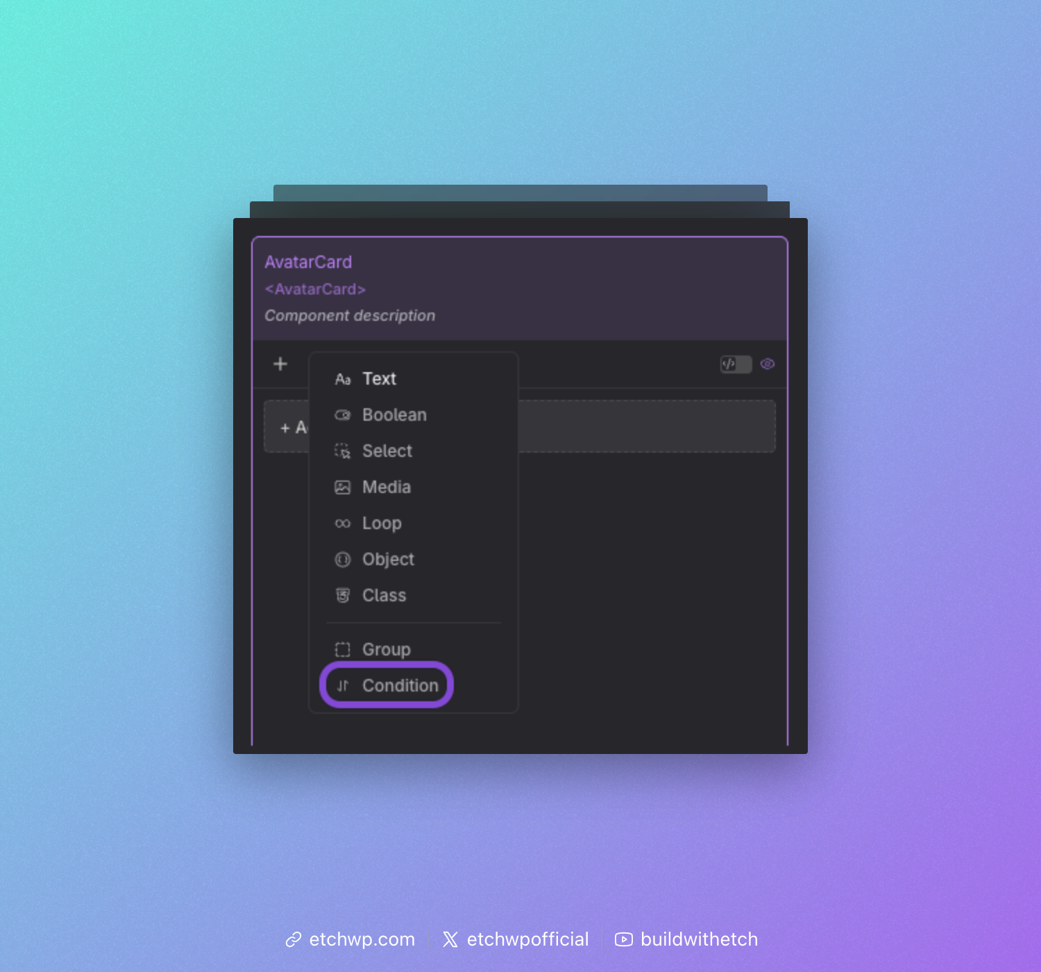
Adding a Condition Prop
In the component editor, open the props panel and select "Condition" from the list.
Defining the Condition
After adding a Condition Prop, you can give it a label to identify it in the editor.
Unlike most other props, the Condition Prop does not have a key. This is intentional: the props nested inside a Condition are added directly to the current level, just as if they were defined outside the condition. No wrapping object is created.
Next, define the condition itself by specifying a condition string similar to how you would for an if element:
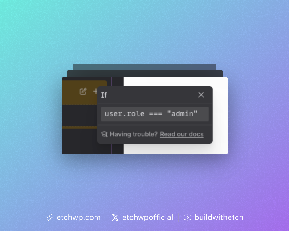
For reference on how to define conditions, see Basic Conditions.
Adding Props to the Condition
You can add props inside a Condition by:
- Dragging existing props into the condition group, or
- Clicking the add button inside the condition to create new props directly within it
All props nested inside the condition will only appear in the editor when the condition is met. This also applies to the Gutenberg block editor, where the corresponding block attributes are visually hidden when the condition is not satisfied.
Example: Button with Optional Link
A common use case is a button that can optionally act as a link. A toggle controls whether the button is enabled, and a Condition Prop reveals the URL and label fields only when it is.
Props setup:
| Prop | Type | Key |
|---|---|---|
| Show Button | Toggle | showButton |
| Condition: showButton is true | Condition | — |
| → Button Label | Text | buttonLabel |
| → Button URL | Text | buttonUrl |
Template:
{#if props.showButton}
  <a href="{props.buttonUrl}">{props.buttonLabel}</a>
{/if}
This keeps your instance inputs clean. The button props only show up when they are actually needed.
Example: Role-Based Fields
Conditions can also reference dynamic data, not just other props. In this example, the current user's role is used to gate admin-only fields so that only administrators see them.
Props setup:
| Prop | Type | Key |
|---|---|---|
| Heading | Text | heading |
| Condition: current_user.role is administrator | Condition | — |
| → Custom CSS Class | Text | cssClass |
| → Debug Mode | Toggle | debugMode |
Template:
<section class="{props.cssClass}">
  <h2>{props.heading}</h2>
  {#if props.debugMode}
    <pre>Debug info...</pre>
  {/if}
</section>
When the logged-in user is not an administrator, the cssClass and debugMode inputs are hidden from the editor entirely, keeping the interface clean for everyday use.
Preview Data
In the component preview, the Condition Prop is treated as transparent. It has no effect on the data structure. All props inside it appear at the same level as props outside it, regardless of whether the condition would be met at runtime.
This means your preview data always includes every prop, so you can preview all nested props freely during development.
Nesting
Condition Props can be nested inside Group Props, and vice versa. You can also nest a Condition inside another Condition to combine multiple checks.
However, keep nesting shallow. Deeply nested conditions make your props harder to understand and maintain. If you find yourself nesting more than two levels, consider simplifying your data structure.