Creating Component Props
Props are the customizable properties that make components dynamic and reusable. They allow you to pass different data and control how components behave in different contexts.
Think of props as the "settings" for your component. Just like how you can adjust the settings on your phone (brightness, volume, etc.), props let you adjust how your component looks and behaves and what it says.
Prop Planning
There are two main types of props:
1. Data Props
Data props are placeholders for content that changes between component instances. They allow you to display different information while maintaining the same structure and styling.
Examples of data props:
- Text content: Titles, descriptions, labels
- Images: Featured images, logos, icons
- Links: URLs for buttons, navigation items
- Numbers: Prices, ratings, quantities
Example scenario: A product card component might have data props for:
productName- The name of the productproductPrice- The price of the productproductImage- The product's imageproductDescription- A brief description
2. Behavior Props
Behavior props control how a component functions or appears. They typically use boolean values (true/false) or specific options to determine component behavior.
Examples of behavior props:
- Visibility controls: Show/hide elements based on conditions
- Style variations: Different visual states (active, disabled, featured)
- Functionality toggles: Enable/disable features
- Layout options: Different arrangements or sizes
Example scenario: A button component might have behavior props for:
isDisabled- Whether the button is clickableisPrimary- Whether to use primary or secondary stylingsize- Small, medium, or large button sizeshowIcon- Whether to display an icon alongside text
Why Props Matter
Props make your components:
- Reusable: Use the same component with different content
- Flexible: Adapt to different contexts and requirements
- Maintainable: Update one component to affect all instances
- Consistent: Maintain design standards across your site
Adding Props in Etch
To add a prop to a component, click the "+" icon near the top of the component editor panel.
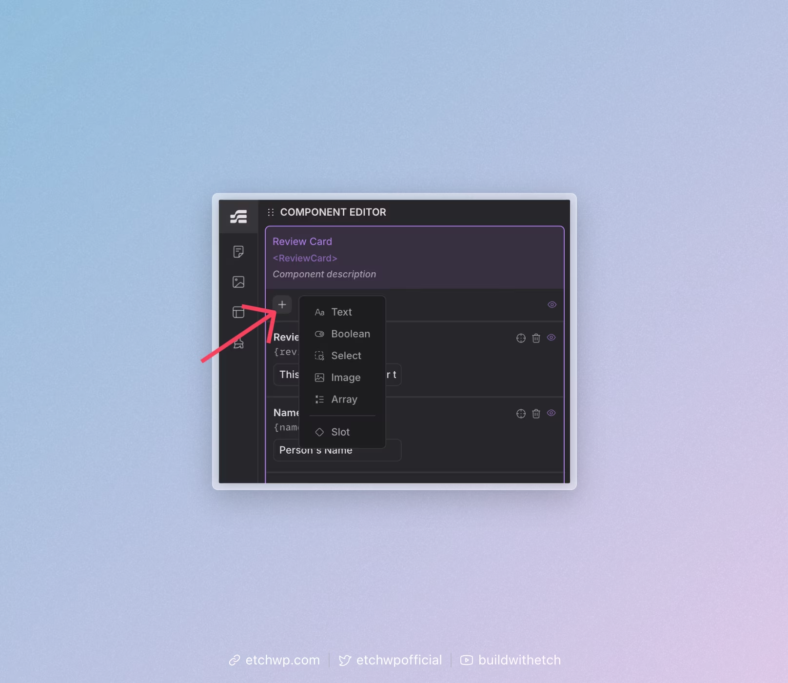
Next, click on the prop type that you're wanting:
Available Props
- Text - A simple text input for titles, descriptions, labels, or any string content.
- Boolean - True/false values for controlling visibility, states, or conditional behavior.
- Select - Dropdown options for choosing from predefined values (like sizes, categories, or themes).
- Media - Media upload and selection for photos, icons, logos, or any other media uploaded to the WordPress media library.
- Loop - Allows selection of a loop source to be used in the component.
- Object - JSON like structure for complex data structures.
- Class - CSS class names for styling structure within the component from the outside.
- Group - A way to group multiple props together for better organization and management.
Once added, you'll see it in the Component Editor.
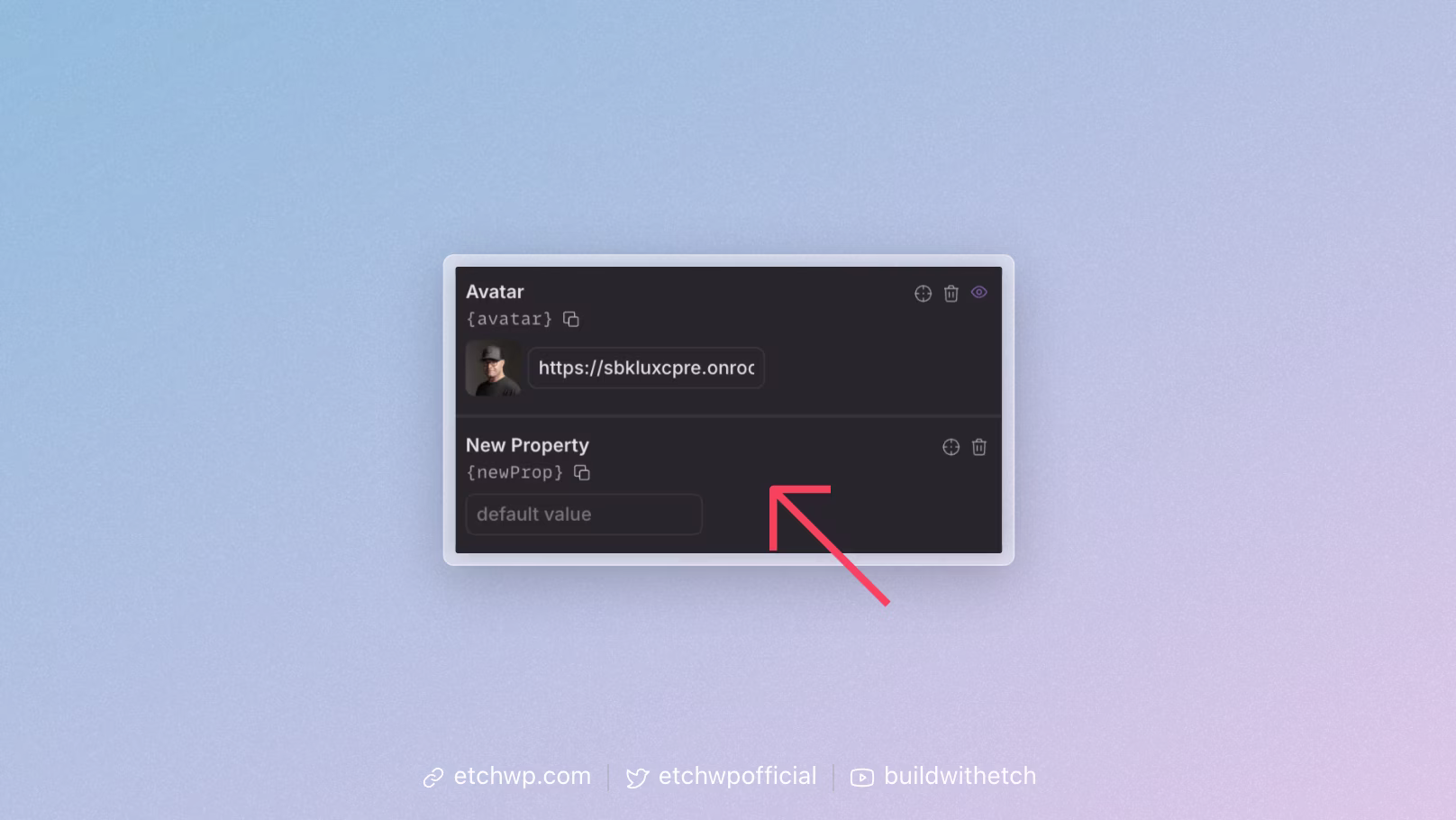
Every prop has two mandatory values: Name & Key
- Label - The display name that appears in the component editor interface
- Key - The internal identifier used in code and data mapping
You can double click the Label to edit and the same is true for Key.
Repeat the process for all necessary props.
Next Steps
Now that you understand the basics of adding props, the next step is: