Slots
Slots are an extremely powerful feature that add tremendous flexibility to your components.
You can think of a Slot as a "drop zone" in a component that can accept any content when the component is being used (on a per-instance basis). It effectively allows you to inject things into a component from the outside, without editing the component or affecting other instances.
This isn't just about adding flexibility for the sake of flexibility. In some cases, slots are mission critical to using components.
A Practical Example for Slots
The easiest example to understand is an accordion component for Frequently Asked Questions.
The accordion heading is almost always just text, so you can easily use a text prop. This will allow us to write the "question" part of the FAQ.
What about the content of the accordion, though - the answer part of the FAQ?
Should it be text? Should it be a combination of text and images? How much text? How many images? What if I want to include a link? What if I want to include a button? How do we determine what style of button?
That's a lot of questions. And if we have to configure props and conditional logic for all the possibilities, that's going to be a tremendously complex component that still ends up with a lot of limitations.
Instead of programming all that complexity via props, all we have to do is define a slot in the accordion content area. Once the slot is defined, users can drop anything they want in the slot and be happy. 100% flexibility with zero complexity!
Without slots, the accordion component would be so limited that it would almost be useless. With slots, the accordion is suddenly a highly flexible and useful component.
Defining a Slot
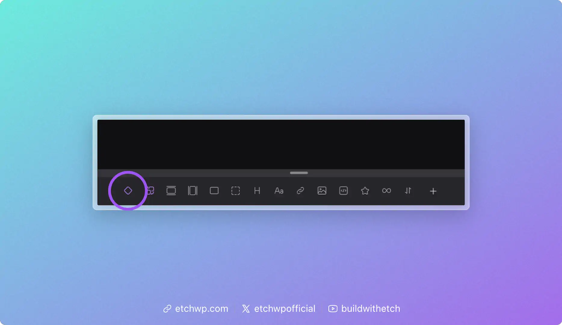
When you're in component editing mode, you'll see an icon in the Elements Bar for the Slot element. Click this icon to add a slot in your component. You'll see it show up in the structure panel as well as the HTML editor:
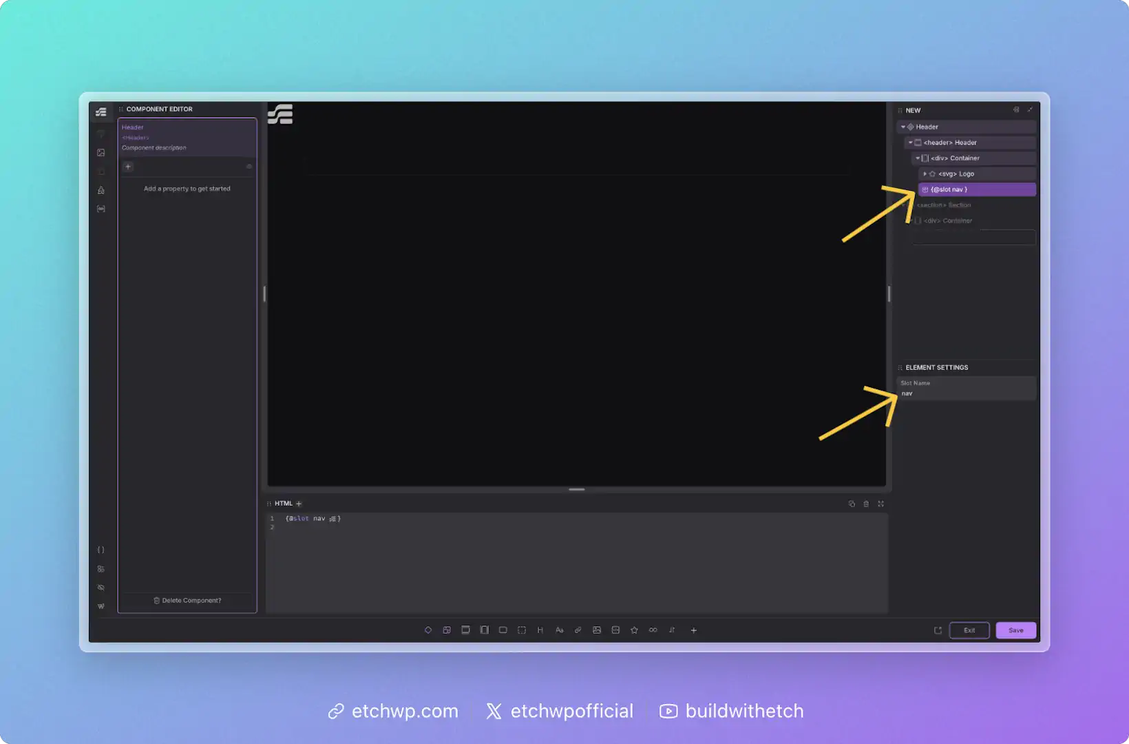
Once you've added a slot, you can name it by editing its label in the structure panel or editing its name in the attributes panel. It's helpful to use a contextual name so that anyone who uses the component knows what it's for.
You can also define your slot simply by writing {@slot yourSlotName} in the HTML editor. This will create your slot and name it at the same time.
Using a Slot
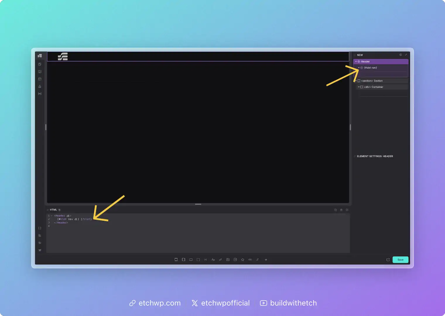
When you add a component to the page, all defined slots will automatically appear and be ready for content.
You can also add your slot simply by writing {#slot yourSlotName}{/slot} in the HTML editor.
A slot is an empty drop-zone that you define at the component level. This means each component instance will have a slot available for unique content. You should not try to add content to the slot from inside the component editor — slots are for adding content to each instance from outside the component editing context (e.g. the normal page development workflow).
The Slots Object
Inside your components, you have access to a special slots object that provides information about each slot. This works similarly to how props gives you access to your component's properties.
The slots object contains an entry for each defined slot, with the following structure:
slots.yourSlotName.empty // true if the slot has no content, false otherwise
For example, if you have a component with two slots named header and content:
slots.header.empty   // true or false
slots.content.empty  // true or false
This allows you to build conditional logic based on whether users have added content to your slots.
Defining Default Slot Content
A common use case is showing default (fallback) content when a slot is empty. You can achieve this by combining the slots object with an {#if} condition.
Here's how to define default content for a slot:
{#if slots.default.empty}
  <p>This is the default content — it will only show if the slot is empty.</p>
{/if}
{@slot default}
When a user adds content to the slot, the default content disappears and their content is shown instead.
Practical Example: CTA Card with Optional Image
Imagine a Call-to-Action card component with an optional image slot. You want to show a placeholder when no image is provided:
<div class="cta-card">
  <div class="cta-image">
    {#if slots.image.empty}
      <div class="placeholder-icon">🖼️</div>
    {/if}
    {@slot image}
  </div>
  <div class="cta-content">
    {@slot content}
  </div>
</div>
This way, users see a helpful placeholder in the builder, but if they add an image to the slot, the placeholder is automatically replaced.
Conditional Wrappers
Another useful pattern is hiding wrapper elements entirely when a slot is empty. This keeps your front-end HTML clean:
{#if !slots.footer.empty}
  <div class="card-footer">
    {@slot footer}
  </div>
{/if}
The .card-footer div won't render at all if the slot is empty — no empty wrappers cluttering your HTML!
Automatic Slot Management
Etch automatically manages slots for you:
- Slots appear automatically: When you use a component, all available slots are instantly ready — no manual setup needed.
- Invalid slots are cleaned up: If you remove a slot definition from your component (e.g., delete
{@slot oldSlot}from your code), empty slot instances will be automatically removed from your pages. Slots that contain content are preserved to prevent data loss.
FAQs about Slots
Can I define more than one slot?
Yep, there's no limit to how many slots a component can have.
What happens if nothing is added to a slot?
If nothing is added to a slot, Etch won't render anything on the front-end. There's no need for conditional logic — slot content is rendered and empty slots are not rendered. You'll never be left with empty wrappers.
What kind of content can I put in a slot?
There's no limitations on what can go inside a slot.
Does content I put in slots apply to all instances of my components?
Nope. Slot content is per-instance. If you want something to apply to all instances of your component it should be hard-coded into your component and not placed in a slot.
Can I limit slots to specific types of content?
No, if you want to limit the user to placing certain types of content, then you should use existing prop types with conditional logic. Slots are specifically designed as generic drop zones.
Can I show default content when a slot is empty?
Yes! Use the slots object to check if a slot is empty and conditionally render fallback content:
{#if slots.yourSlotName.empty}
  <p>Default content here</p>
{/if}
{@slot yourSlotName}
See the "Defining Default Slot Content" section above for more examples.