Using Media Queries
While Etch promotes a container-query-first workflow, there are still legitimate use cases for media queries. This guide covers when and how to use them effectively in Etch.
When to Use Media Queries
Media queries respond to the viewport — the size of the browser window or device screen. They're the right tool when your styling decisions genuinely depend on the overall screen size rather than an individual component's available space.
Common use cases include:
- Top-level page layout — switching between a sidebar layout and a stacked layout based on screen width
- Global typography adjustments — scaling root font sizes or line heights for different screen categories
- Showing or hiding global UI elements — like a mobile hamburger menu that replaces a desktop navigation bar
- Print styles —
@media printfor controlling how pages render when printed - Orientation or input-based queries —
@media (orientation: landscape)or@media (hover: hover)for device capability detection
If the responsive behavior is about a component adapting to its space, use a container query instead. If it's about the viewport or device itself, a media query is appropriate.
Media Queries in Etch
Auto query insertion
Etch handles media query insertion the same way it handles container queries — automatically, based on your canvas state:
- Drag the canvas to the width where you want a responsive change
- Etch displays the exact canvas measurement at the top of the canvas
- Click the media query button in the CSS Quick Actions Bar
- Etch auto-inserts a
@mediablock using the current canvas width as the query condition - The CSS Quick Actions Bar resets so you can start adding styles immediately
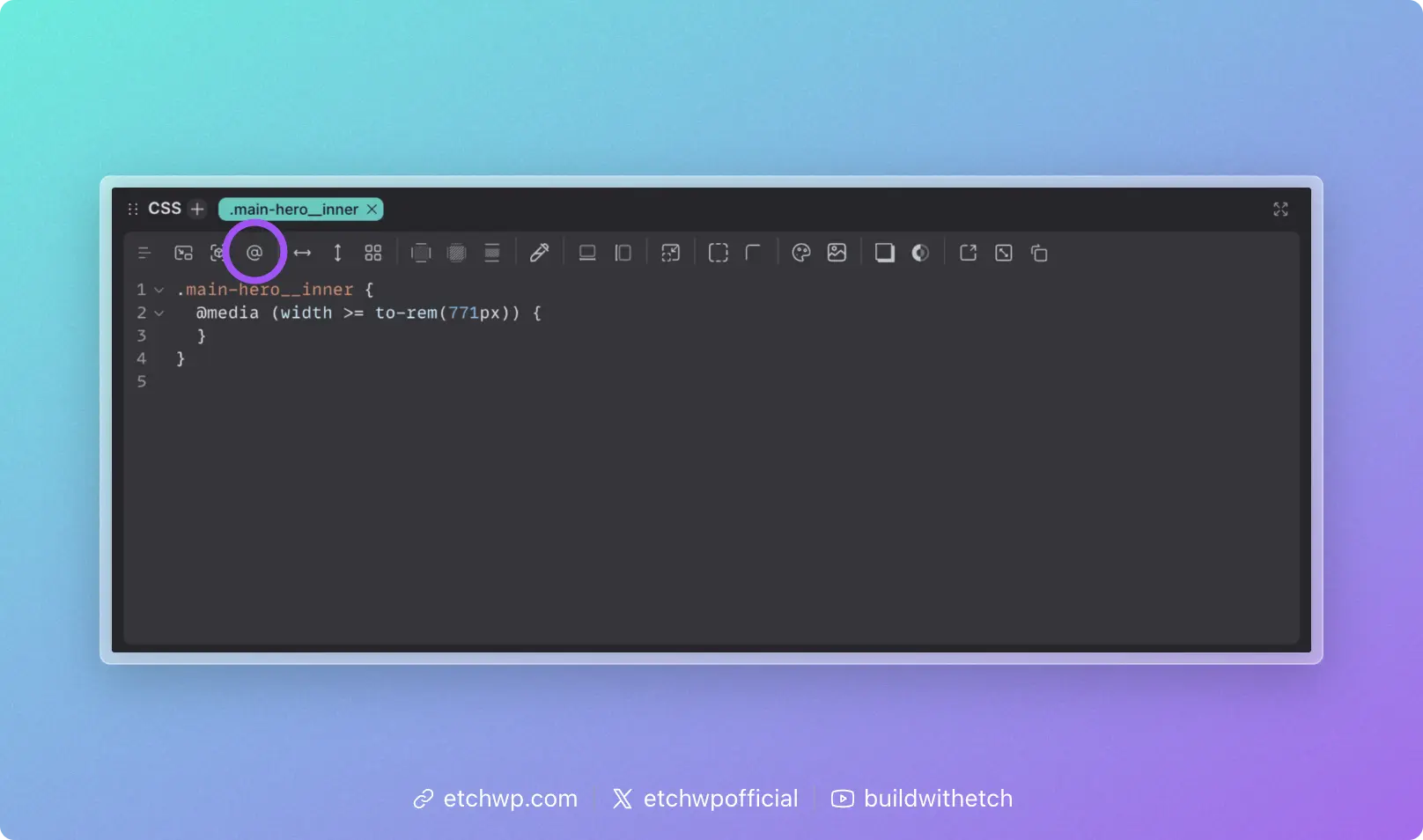
This means you never have to guess at pixel values or remember arbitrary breakpoint numbers. Your media query conditions are always driven by the exact point where your design needs to change.
Syntax Reference
Basic media query
.site-header {
	display: flex;
	flex-direction: column;

	@media (width >= 900px) {
		flex-direction: row;
		justify-content: space-between;
	}
}
Max-width (mobile-first inversion)
.sidebar {
	@media (width <= 768px) {
		display: none;
	}
}
Range syntax
Modern CSS supports range syntax for media queries, which is more readable than the traditional min-width / max-width approach:
/* Modern range syntax (recommended) */
@media (width >= 600px) { }
@media (width <= 900px) { }
@media (400px <= width <= 800px) { }

/* Traditional syntax (also valid) */
@media (min-width: 600px) { }
@media (max-width: 900px) { }
@media (min-width: 400px) and (max-width: 800px) { }
Both syntaxes work in Etch. The range syntax is generally preferred for readability.
Multiple conditions
.element {
	@media (width >= 900px) and (orientation: landscape) {
		/* landscape on larger screens */
	}
}
Multiple conditions using and are not compatible with @custom-media tokens. If you need a reusable query with multiple conditions, define the full compound condition as a single @custom-media rule instead.
Non-size queries
Media queries aren't limited to dimensions. They can also detect device capabilities:
/* Only apply hover styles on devices that support hover */
.button {
	@media (hover: hover) {
		&:hover {
			background-color: var(--accent);
		}
	}
}

/* Respect user preference for reduced motion */
.animated-element {
	transition: transform 0.3s ease;

	@media (prefers-reduced-motion: reduce) {
		transition: none;
	}
}

/* Dark mode preference */
.surface {
	@media (prefers-color-scheme: dark) {
		background-color: var(--dark-bg);
	}
}
Using @custom-media tokens
For recurring media query conditions, define them as @custom-media tokens to avoid repeating raw values:
/* In your Custom Media Definitions stylesheet */
@custom-media --nav-collapse (width <= 820px);
@custom-media --large-screen (width >= 1200px);
/* Then reference by name */
.nav {
	@media (--nav-collapse) {
		/* collapsed layout */
	}
}

.hero {
	@media (--large-screen) {
		padding-block: 6rem;
	}
}
See Custom Media for setup details.
Media Queries vs. Container Queries
If you're unsure which to use, ask yourself: "Does this style depend on the viewport, or on the space available to the component?"
- Viewport → media query
- Available space → container query
In practice, most component-level responsiveness is better handled with container queries. Media queries are best reserved for global layout decisions and device/user-preference detection.