Using Container Queries
Container queries are a powerful CSS feature that allows you to style elements based on the available space they're placed in, rather than the viewport. This enables more modular and reusable components that adapt to their context, regardless of where they're placed on the page.
Container queries are fundamentally different from media queries. While media queries respond to the size of the viewport (the device or browser window), container queries respond to available space, enabling truly context-aware responsive design. To learn more about the philosophy behind this approach and why Etch promotes container queries over traditional breakpoints, see the Philosophy article.
How Container Queries Work
Container queries require two things:
- A query container — a parent element that tracks its own size
- A container query rule — a style block that applies when the container reaches a certain size
Step 1: Define a container
A parent element needs container-type: inline-size to become a query container. This tells the browser to track the element's inline (horizontal) size so that descendant elements can query against it.
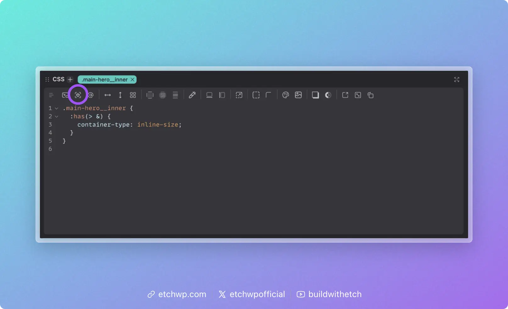
The most effective way to do this is with the "Has Me" selector — :has(> &). Instead of manually adding container-type to a specific parent class, you declare it from the component/block itself:
.card {
	:has(> &) {
		container-type: inline-size;
	}
}
This targets whatever element is the direct parent of .card and sets it as a container. The advantage is that the component carries its container context with it — no matter where .card is placed, the parent automatically becomes the query container. You don't have to remember to add container-type to a separate selector, and the component remains fully portable.
Etch can auto-insert the "Has Me" selector for you via the responsive controls — just click the "Has Me" icon in the CSS Quick Actions Bar. It's recommended to add it before writing any container queries.

You can also define a container manually on a specific parent if needed:
.card-grid {
	container-type: inline-size;
}
This approach works fine, but couples the container query behavior to a specific parent. If .card moves to a different context, you'd need to ensure the new parent also has container-type set.
Step 2: Write a container query
Once a container is defined, you need a @container rule to apply styles based on the container's width.
The easiest way to do this in Etch is with auto container query insertion. Drag the canvas to the point where your design needs to change, and click the container query button in the CSS Quick Actions Bar. Etch will auto-insert an @container block using the selected element's exact measurement as the query condition — no manual pixel values needed. The CSS Quick Actions Bar then resets so you can immediately start adding styles inside the query.
The result looks like this:
.card {
	display: grid;
	gap: 1rem;

	:has(> &) {
		container-type: inline-size;
	}

	@container (width >= 500px) {
		grid-template-columns: 200px 1fr;
	}
}
In this example, .card switches to a two-column layout when its container is at least 500px wide — regardless of the viewport size. The same card could appear in a full-width section, a sidebar, or a grid column, and it adapts to each context automatically.
Container Queries in Etch
Etch streamlines the container query workflow so you rarely have to write query conditions by hand.
Auto query insertion
When you have an element selected and drag the canvas to a size where you want responsive changes:
- Etch displays the exact measurement of the selected element
- Click the container query button in the responsive controls
- Etch auto-inserts a
@containerblock using the element's current measurement as the query condition - The CSS Quick Actions Bar resets so you can immediately add styles
This means your container query breakpoints are always driven by the actual dimensions where your design needs to change.
Auto "Has Me" insertion
The responsive controls also include a dedicated button to auto-insert the :has(> &) container declaration. Use this before adding your first container query on a selector.
When to Use Container Queries
Container queries are the right choice when a component's layout should depend on how much space it has, not how big the screen is. This covers most responsive scenarios:
- Cards that switch between stacked and horizontal layouts
- Navigation that collapses based on available width
- Sidebars that reorganize when the main content area shrinks
- Grid items that adapt as column counts change
- Any reusable component that might appear in different contexts
Container Queries vs. Media Queries
| Container Queries | Media Queries | |
|---|---|---|
| Responds to | Available space (parent container) | Viewport size (browser window) |
| Best for | Component-level responsiveness | Global layout and viewport concerns |
| Reusability | Components adapt to any context | Components tied to viewport assumptions |
| Etch's recommendation | Primary tool for responsive design | Use when you specifically need viewport awareness |
For scenarios where you do need viewport-based queries, see Using Media Queries.
Syntax Reference
Basic container query
.component {
	@container (width >= 400px) {
		/* styles when container is at least 400px */
	}
}
With "Has Me" for automatic container context
.component {
	:has(> &) {
		container-type: inline-size;
	}

	@container (width >= 400px) {
		/* styles when container is at least 400px */
	}
}
Multiple query thresholds
.component {
	/* Base: single column, stacked */

	:has(> &) {
		container-type: inline-size;
	}

	@container (width >= 400px) {
		/* Mid-size adjustments */
	}

	@container (width >= 700px) {
		/* Larger container adjustments */
	}
}
Using @custom-media tokens
If you have recurring container query conditions, define them as @custom-media tokens and reference them by name:
.component {
	:has(> &) {
		container-type: inline-size;
	}

	@container (--component-wide) {
		grid-template-columns: 200px 1fr;
	}
}
See Custom Media for setup details.